
The number of mobile users is growing significantly and WordPress for mobile is following the trend and becoming more assertive and this is something that their projects supported, ensuring the best experience for your users.
WordPress is mobile friendly and it is not today.
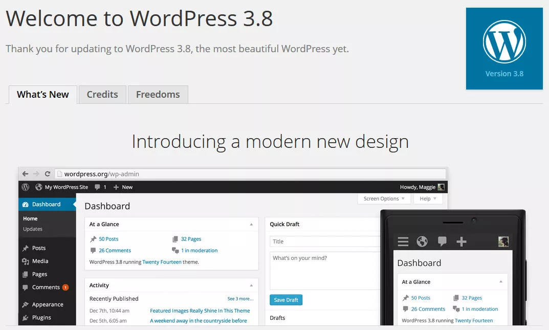
The version 3.8 of WordPress launched on 12 December 2013 introduced a modern and responsive design in its entire administrative panel. Since then you can manage projects in WordPress through its official applications or web browser on your mobile device, since the screen is friendly and responsive to these devices.
Mobile users around the globe
The number of mobile users around the globe is promising and a reality that needs to be explored by technology and marketing professionals.
43% of mobile users make use of messaging applications. The success of these messengers is constant and to understand this, we can simply analyze the use of dominating WhatsApp and Messenger, both from Facebook.
As it comes to the consumption of video on mobile, representation is 35%. We live in a time of YouTubers and there is a constant struggle for the preferred platforms from YouTube, Facebook and Snapchat.
When a Social survey was conducted, Pokemon Go had not been released. If it would have been released, the number would have been greater than 21% of the population of players in the mobile environment.
The banking transactions are carried out by 28% of the population only through the phone. It is common for people to avoid going to banks to avoid losing time with bureaucracy and long queues.
The maps services in the mobile are used by 33% of people. This number tends to grow with the increasing use of applications like Uber that are increasingly adopted to move around.
Mindset: The difficulty in adopting mobile
Much is said about the benefits and the necessity to carry out web projects with the concept of mobile first.
My perception is that it is difficult for professionals to think and design initially for smaller screens and then for the larger one and no one has tried reverse engineering.
And that’s a great paradox. People who access and make use of the web projects using the tables of bars, in bank lines, airports and many others; in family and friends meeting; traffic either as passenger or driving, unfortunately; and the list goes on. On the other hand, the designers who go through the same situations using large screens or two monitors in their work and prioritize these devices or try to occupy as much of the white space.
The broad adoption of mobile-first or mobile-only, will come with this change of mindset. The web professionals need to reverse the logic of thought, design, although many of the decisions are top-down and it is necessary to hit the front and show numbers, benefits and gains to be achieved today and in the future.
WordPress Mobile
As previously mentioned, since 2013 WordPress is completely mobile friendly. Administrative interface and its standard themes that come with the installation are mobile friendly.
Mobile Development with WordPress
The first way to decide is to define the type of development that will be adopted: Buy a theme and customize it or develop everything from scratch. Both ways can be followed for the mobile development with WordPress and what will determine your choice will be the desired value for money.
Develop all from zero or make use of a ready to use theme will impact directly on trivial issues to the success of your project, for example:
- Implementation of Mobile First and Responsive Design;
- Focus on performance and optimization codes and static files;
- HTML markup oriented SEO;
- Technical Accessibility;
- Application Security.
Mobile First Responsive Design
Mobile First is a concept applied to web projects where the initial focus of the architecture and development is directed to mobile devices. The mobile sites are divided into three types and Responsive Design is what Google prefers.
Applying this concept and technique in your projects will ensure that you get the best mobile friendly website which will ensure the best possible experience for its users. And speaking of the user experience, Google is considering it as an important criterion for their search results.
If you consider developing a WordPress website from the scratch, it is important that the whole team knows, understands and adopts a mobile stance, otherwise, you may experience failure at some point. If the choice is ready to use a theme, it is also necessary to have knowledge and understanding of the subject for analysis and choice of theme.
Performance
Ready to use themes offers too much customization options and overload the website with excessive loading of CSS and JavaScript files, for example. You can perform a job focused on optimizing WordPress, but in some scenarios the challenge is great.
In projects developed from scratch, it is possible to have the questions about performance from the start so it is better to adopt techniques for the best results in this direction, as the use of optimized files, conditional charging pages, optimized images, use sprite and various other techniques.
There are several tools for analyzing and measuring the performance of your project. Google Pagespeed is one of them and this tool analyzes the provided URL and gives a score from 0 to 100. Aim to reach at least 85 points. From that point, Google considers your site as performative.
Management
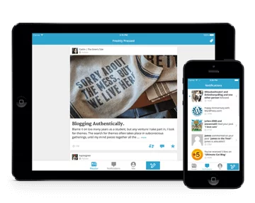
Mobile Apps for managing sites in WordPress can make this task simple. Its user friendly interface and the management can be accomplished through applications for Android and iOS or with direct access to your Panel that since 2013 is fully responsive and every new version have been implementing improvements and adapting new tendencies.
Much of ready themes have a panel to its configuration and not all of them are responsive which could affect the management experience through mobile devices.
IF THE
The optimization for search engines is always a determining factor in web projects due to great influence of Google in generating traffic. Being well positioned in this search is important because it guarantees more business opportunities.
Developing WordPress website from the scratch allows us to have SEO in the design from the beginning taking a HTML semantic markup, well structured, make use of Rich Snippets, Microformats and the best structure as a whole and guided by expert advice from experts.
In ready to use themes, you cannot always do proper SEO because of lack of use of the H1 tag, for example, or excessive use of HTML codes and CSS generating a problem of Low text to HTML ratio.
Safety
WordPress is safe, insecure you are. For your project to be properly protected, it is important to define and adopt security process for WordPress.
Developing a WordPress Website from the scratch or the use of ready to use theme codes requires analysis and practices that are commonly exploited by hackers as XSS, SQL Injection, CSRF and many others.
WPScan website has a catalog of vulnerabilities that are found in the core platform of Plugins and Themes, allowing you to easily see the name of the add-ons that will be used and be assured of their safety.
Security Certificate
The adoption of security certificates is increasingly popular. With the imminent arrival of HTTP 2, it will be mandatory to use. Google considers it as a factor of relevance. And before that, a use of it was exclusively in financial institutions and online stores but now it is commonly used throughout the institutional websites and blog, for example.
The annual cost of the certificate and its implementation is no longer a stumbling block with the arrival of Let’s Encrypt that provides free certificates. The only thing is that, it needs to be renewed after every three months.
REST API
Through REST API, you can integrate your web design with any external application. Its arrival from the platform version 4.4 opened unimagined possibilities of WP use and increasingly will be common to see even more amazing applications.
Explosion of Mobile
With the explosion of mobile accesses growing considerably, initiatives are emerging to have pages that are loading faster and faster. Facebook and Google are behind two major initiatives in this line, the Facebook Instant Article and Accelerated Mobile Page (AMP).
Facebook Instant Article

With the implementation of Facebook Instant Article, users will have a richer and faster experience in reading the shared content on the largest social network on the planet. The resource is identified by a radius at the top right of the content in the news feed of Facebook.
This implementation has brought significant results:
- 10x faster loading than traditional articles pages;
- 20% on average more readings;
- 70% chance of lower abandonment of articles.
Accelerated Mobile Pages (AMP)
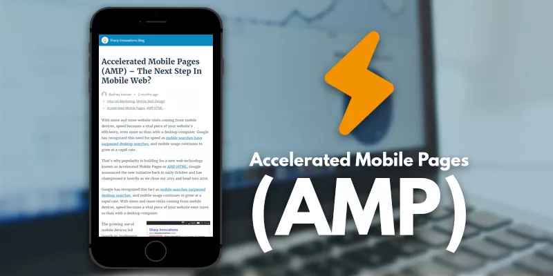
The Accelerated Mobile Pages (AMP), unlike Facebook Instant Article is an open source initiative tops by Google. The focus is to load content extremely fast and reduce the abandonment of users due to the page loading time.
WordPress is Mobile, what about your project?
Adopt strategies in your web project that benefits the mobile device ensuring a better experience for users, better results in search engines and surfing a growing and important wave for digital business.
Mobile-friendly WordPress website allows you to go further and adopt custom-oriented strategies with the goal of your business. Mobilize with WordPress.
