
Google Fonts are used everywhere. Their popularity cannot be denied. And there is a reason for that. Apart from being absolutely free, they offer great customizations and are easy to use.
One of the reasons why Google fonts are very popular is their ease of use. If you use WordPress for your websites that are hosted on managed WordPress hosting like Nestify, using Google fonts is a piece of cake.
Google Fonts is a directory of selected open-source fonts curated by the Google team and developed by font developers and agencies around the world. It was founded in 2010. Since then, it is regularly being updated and as of writing this article, it has 915 fonts. All are free for personal as well as commercial use. These fonts are of high quality and pass the standards of legibility and readability.
Accessibility is the main feature of Google Fonts. As these are open source, anybody can use it. Plus, these are maintained at Github repository. Anyone can download the fonts. Just a single line of url is enough to grant you access to Google Font of your choice. The installation is quite simple. And within seconds, you are set with new fonts. There are so many options to choose from.
- 10 Most Popular Google Fonts
- Get The Best of Google Fonts With Font Combinations
- How To Create Right Font Combinations Yourself
- A Few Things to Know While Using Google Fonts on WordPress
- FAQ’s
Here are the most popular top 10 Google Fonts.
10 Most Popular Google Fonts
10. PT Sans
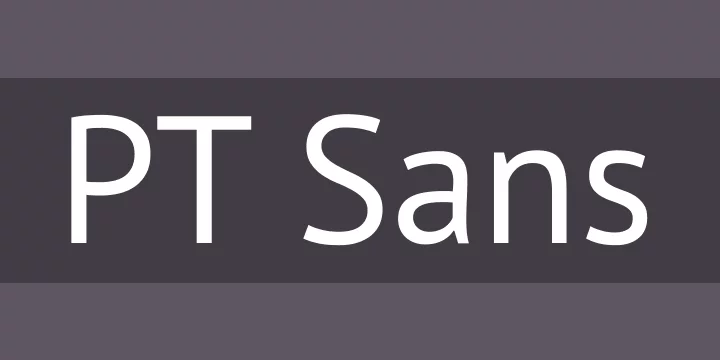
The Public Type Fonts, of which PT Sans is the most popular, are libre licensed open source fonts. It has been viewed 428 billion times as of now with crossing more than 95 billion views in the past year itself.
It is designed by the Russian design agency ParaType. It is one of the most popular forms on the internet. They include Latin and Cyrillic characters. They have 4 styles.
9. Raleway
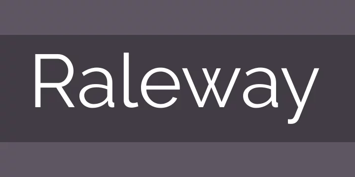
Designed by multiple designers, Raleway is used by more than 457 billion users around the world. In the last year, 142 billion-plus viewers used this font. This is a 14% increase compared to 2017. Raleway is featured in more than 8 million websites. It comes with 18 styles.
8. Montserrat
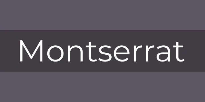
One of the fastest growing font in recent times, Montserrat was developed by 4 developers; Julieta Ulanovsky, Sol Matas, Juan Pablo del Peral, and Jacques Le Bailley.
591 billion views over its lifetime, and if that’s not impressive, consider the 226 billion views in the last year. That’s a growth of a whopping 40%. This font definitely ranks among the most attractive ones.
7. Source Sans Pro
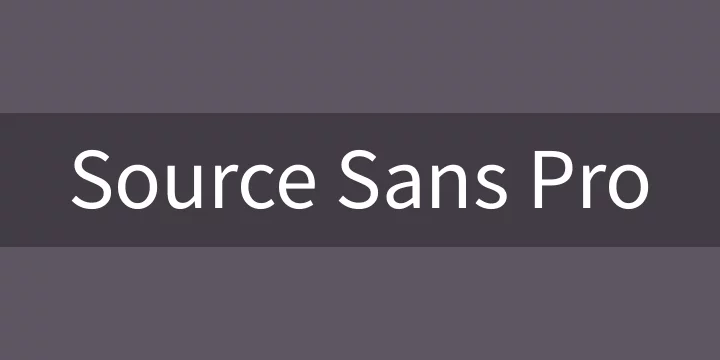
Source Sans Pro is the first open source typeface family by Adobe. It was designed by Paul Hunt. It is a sans serif typeface. It’s no miracle that this font is downloaded more than 633 billion times. Last year, it gathered 188 billion views. This is an increase of 14%. It has got 12 styles.
6. Roboto Condensed

This is a miniature version of popular font Roboto. It contains only 6 styles. Despite that, it is hugely popular. It ranks number 6 in the top 10 for the last year, i.e. Jan 29, 2018-Jan 29, 2019.
This version, like the original, is also developed by Christian Robertson. This font features friendly and open curves. The forms are largely geometrical with a mechanical skeleton.
Roboto Condensed gathered more than 760 billion views in its lifetime. Last year, the statistics for the same was 220 billion. This is a minor growth of just 1% over last year. This font can be used with normal Roboto family and Roboto Slam family.
5. Oswald

Inspired by “Alternate Gothic” sans serif typefaces, Oswald was developed by Vernon Adams. It was launched in 2011. In 2016, Kalapi Gajjar and Alexei Vanyashin updated the font family to support Cyrillic characters. Close to 900 billion views so far, it will soon cross the trillion mark for sure. It registered a growth of 6% over the last year. The number of views in the last year was more than 201 billion. This is a font that you must check out before you select your final options.
4. Slabo 27px

This font was developed by John Hudson. He is an expert contributor to Unicode. This font has been viewed by more than 950 billion. It has just one style. It has seen a change of -60% compared with last year. Still, the views for the past year were 167 billion. These are size specific fonts. These are mostly used in online advertising and other web uses.
3. Lato

Ranking third on our list, this font was developed by Warsaw-based developer Lukasz Dziedzic. This project was started in 2010. It has gathered 1.3 Trillion views since then. Lato is sans serif typeface. In the past year, it was viewed 434 billion times. This is an increase of 16%.
2. Open sans
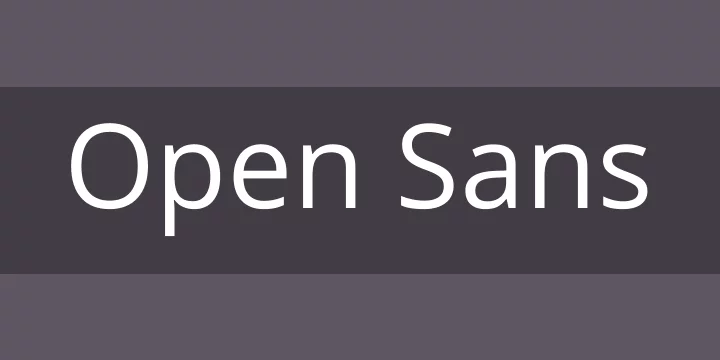
This second-most popular font was designed by Steve Matteson. This is humanist sans serif typeface. It has 10 styles. It is optimized for print, mobile, and web interfaces. It has excellent legibility characteristics in its letterforms. It is designed with upright stress, open forms, and friendly appearance. It has been viewed a whopping 5.6 Trillion times so far. In the last year itself is got 1.47 Trillion views. This is an increase of 5% over the last year.
1. Roboto

This all-time number one font has incredible 6.3 Trillion views since its inception. This speaks of its legibility and diverse application. It has got 12 styles. It has a mechanical skeleton and fonts are geometric. It features friendly and open curves. This gives a more natural reading rhythm. It is growing in its popularity. This evident from its 2.93 Trillion views last year. This is a change of 36 % over the last year. Significant, isn’t it?
So, these were the most popular Google fonts. You can browse all the Google Fonts here. Browse through the vast library of carefully selected fonts and choose the one that best suits your needs.
Get The Best of Google Fonts With Font Combinations
Google fonts are great. The fonts are even more effective when you use the right combination of them. Instead of using just one font throughout, you can use combinations of fonts to make your content appear even more awesome. For example, you can choose one font for Heading and another for Body. There are innumerable font combinations possible. How can you find the right kind of pair? Here are some tools that can help:
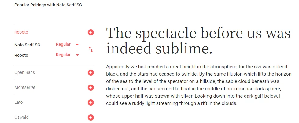
1. Font Pairing suggestion by Google Fonts
When you choose to see the specimen of any font on Google Fonts website, you get to see the various styles available. Just below the styles, you will see “Popular Pairings” with that particular font. Here you will get an idea about which font pairings are most popular for the font you are seeing.
2. Font Pairing Suggestion by FontPair
There is a dedicated website that helps you pair Google Fonts. The site is called FontPair. It shows featured font pairs. You can view the font pairings in action on actual web pages. It shows a beautiful representation of font pairs. You get to see how the font pair will look like.

How To Create Right Font Combinations Yourself
You can certainly experiment and find the right font pairs that suit your needs. There are more than 900 Google fonts and it can be tedious to choose the right font combination for yourself. Here are some guidelines that might help:
- Visual Diversity: The rationale behind selecting multiple fonts is to create visual diversity. We want the content to appear pleasing to the eye. A right font combination achieves just that by looking visually appealing. Thus, selecting fonts that either complement or contrast each other is better than pairing similar looking fonts. Keep the principle of Visual Diversity in mind and you will be on the right path to select your font pair. Just remember not to take it to the extreme and ruin your design. Balance is the key and you know it when you see it.
- Pairing Serif and Sans Serif: This is a classical way and one that never fails. Pairing a Serif font with a Sans Serif font always works. Serif fonts have strokes at the edges of the letters and Sans Serif fonts do not. This contrast looks visually appealing.
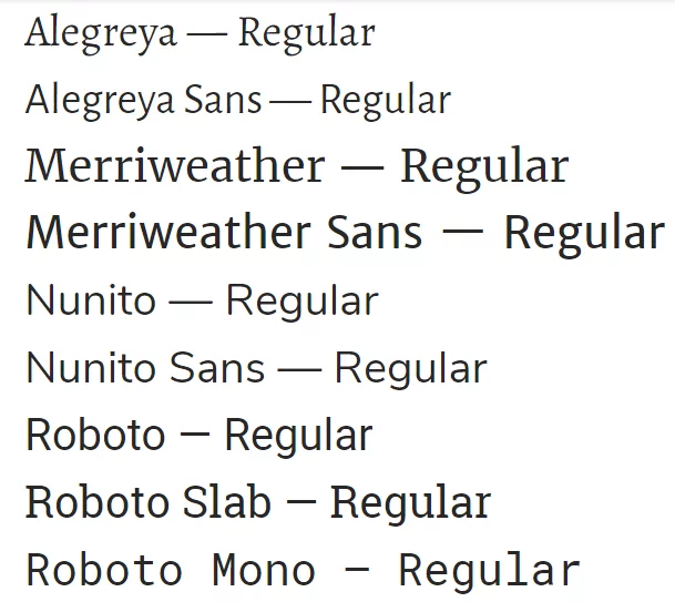
- Pair Using Superfamilies: According to Google Fonts, a superfamily is a set of typefaces that are crafted to work together in close harmony. You can use fonts from these superfamilies to create a magical effect. Here is the list of superfamilies at Google Fonts.
A Few Things to Know While Using Google Fonts on WordPress
So you have decided to choose Google Fonts on your WordPress website. Congratulations! There is a lot to know when it comes to fonts and typography is a never-ending subject. You don’t have to be an expert in typography in order to use Google Fonts. You just need to be aware of the following few things:
- Font Weights:
When we use bold or regular, we are referring to font weights. Font weights range from Extra Light to Extra Black. Each font supports different font weights. Fonts weights are generally represented in numbers. For example, regular is represented by the number 400 while 700 corresponds to bold. Following diagram will give you an idea about how different font weights appear visually.
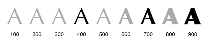
Photo Credit: Web Font Optimization By Ilya Grigorik
2. Performance Benefits:
Are there any performance benefits of using Google Fonts? Indeed, there are. Google Fonts API serves Google Fonts to the browser and fonts are stored in the browser cache, so the loading times are faster. Moreover, a vast number of websites use Google Fonts nowadays. Thus, your users will most probably have the Google Font you are using in their browser cache. This saves you crucial server resources of your WordPress website as your web server doesn’t need to serve the font files. Apart from speed, maintainability, and accessibility are two important benefits of using Google Fonts.
3. Accessibility: There is a significant percentage of internet users who have some kind of disability. If you do not take into account their special needs, your content is likely to be inaccessible to them. Thanks to the customizations offered by Google Fonts, you can customize your fonts to be accessible to users with low vision. You can find useful tips to make your content more accessible at WebAim. Their color contrast checker and color reliant link contrast checker tools can be useful to make your content more accessible.
FAQ:
Can Google Fonts be used for print?
Yes, you can! Google Fonts are open source and you can use them for any project; online or offline, personal or commercial. However, note that Google fonts are web-optimized fonts, meaning they are designed look great on screens. They are not necessarily print-optimized like desktop fonts. So you might need to make certain adjustments to the Google font you are using if you want to print it. The issue is not one of licence but whether it will look good on print or not.
Can I use Google Fonts for Commercial Use?
Yes, you can. All Google Fonts are released under open source licenses. This allows you to use Google Fonts for any commercial purposes and projects. However, some search results may show fonts developed by external foundries. These may not be free for commercial purposes. Make sure the font you are using is in the Google Fonts Catalogue and not from an external foundry. You can access the entire Google Fonts catalogue here.
How do I add Google fonts to my computer?
It is easy to add Google fonts to your computer. To do so follow these steps:
- Go to Google Fonts directory
- Select the fonts you want
- You can add these to your collection
- Once your collection is ready, simply choose “download”
- This will download a zip file to your computer. Unzip it and extract the fonts to the fonts folder in your system directory.
- The Google Fonts are available for use on your computer now. You can use them in your documents, notes or presentations.
Will Google Fonts slow down my website?
Yes and No. Google fonts are loaded from Google’s own CDN which is a lot faster and the fonts are compressed to decrease the load times. Plus, Google Fonts are stored in browser cache of users. Since Google fonts are hugely popular, it is likely that the users may already have Google font used in your website. This will save the loading from Google CDN and in turn, increase your page load time.
There is another side to it. If your website is using lots of fonts with varied styles and weights, this will obviously slow down your website. It is thus recommended that you use selective fonts and fewer font weights.
What are the best Google Fonts?
The best Google fonts are subjective, they differ for each one. Plus, there are more than 900 to choose from. This makes the selection of the best a bit difficult. We have covered Best Google fonts here. You can consult your UI/UX expert to select a Google font for your particular business.
So this was our take at the best Google fonts in 2019 and how to make the best use of them. You have learned which Google Fonts are the most popular. You know what things to keep in mind while using Google Fonts on WordPress. You now know the importance of font pairing and how you can create the best Google Font combinations for yourself. Did this article help you? Do share it. Let us know in the comments if there is anything else you want to know about Google Fonts
