You’ve read that mobile users read web content differently, do not read long texts, and prefer immediate consumption of videos and memes. Do you know what the myths are?
Other myths you will read are that mobile users have scattered attention for messaging interruptions, Twitter, and other notifications, or that they do not want to learn but quick answers to their questions or doubts.
Is it true that mobile users read differently? But how?
Realities about the mobile web
There are some data and realities that you should keep in mind regarding the mobile use of the web:
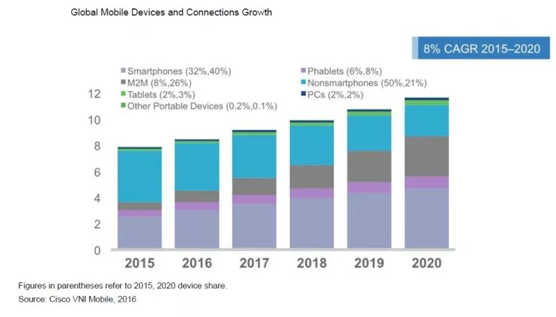
- Since 2013 mobile users have been growing and continue to grow, making a huge difference.
- 57% of users will abandon a slow site, and 80% will not come back to visit.
- For every second of your web upload time, you lose 11% of your audience.
- 75% of mobile users will visit your competition if you do not have a mobile-friendly design.
- There are no generational differences in the use of mobiles.
- In 2015 the purchase of smartphones and tablets had already surpassed that of desktop computers.
- There are already six times more mobiles than computers.
- By 2020 we will have more than 256 million mobile users.
- 70% of the world’s population has at least one mobile device.
- Users with a non-technological profile first learn to use a mobile phone rather than a computer.
If you have not been clear enough, Mobile has already surpassed the computer! And the trend continues along that path.

I do not know if it involves the death of the home PC, being relegated to business uses, but I no longer conceive of the personal computer as a digital extension of us. That position has taken the mobile assault.
What is also clear is that you have a strategy adapted to mobile content, taking into account the particularities of using the web from these devices.
Myths and realities about mobile users

Let us review the myths about mobile users:
- They do not read texts that are too long.
- They prefer fast consumption of images, videos, infographics, and memes.
- They do not want to learn, and they seek quick answers.
- They cannot focus their attention because of distractions from notifications.
- They can only read when they have the phone in their hand.
And now the realities of mobile users:
- As they carry their Mobile by hand everywhere, they have more opportunities to read exciting content without waiting to get to their desktop computer.
- Whether on public transport, waiting in a park, before going to sleep, or having a drink in a coffee shop, the mobile user is ready to read if you can offer valuable content.
- Addiction is associated with mobiles, which do not allow us to lose anything about what is happening. The mobile user is a slave of immediate information and considers it to be up to date.
- Precisely because of the dispersion of attention to which it is usually subject, the mobile user prefers content with only text, perhaps some image that occupies 100% of his screen, without ads or aesthetic resources that distract or disturb him.
What conclusion can we draw from all this information?
If we can provide exciting content in a suitable format, we will capture the attention and win loyal mobile users.
The mobile user reads long texts.

Yes, sign it because it is so. Just because the mobile user has more time to read them and carry the Mobile always, and because the mobile reading the text is predominant, without visual elements that distract, the mobile user is willing to read long posts, as long as it captures their interest.
No matter if you do not give them time to read it at the time, if it is interesting enough, keep rereading it at the next opportunity (bus stop, elevator, during the commercials of their favorite series, etc.)
If I look at my statistics, the most read articles on mobile devices are precisely the more extended, a couple of interesting, especially those with a structure adapted to the mobile user.
The mobile user is your best ambassador.

It is amply demonstrated that the mobile user is more inclined to share content, if only because precisely these devices are specially prepared for it.
The mobile user does not see the Internet as a separate space (the web, networks, forums, etc.) but as a great network in which the content is as relevant as it is shared in different areas.
Thus, for the mobile user, it is an entirely natural act of sharing a publication that seems relevant to their Twitter profiles and Facebook or discloses on their LinkedIn network and even sending it by Whatsapp to their contacts.
Rules for writing mobile content

Considering the above, if you take into account several rules and tips to improve the reading experience for mobile users, you can obtain a more excellent distribution of your content.
The screen is everything.
Just as web content marketing has historically taken into account the heat maps of desktop display, mobile navigation has already been overcome.
The mobile user wants the content that fits on their device to fill their screen without any distracting text element.
The mobile user, but you may not want to walk resizing your web to read your texts properly. So you must offer a mobile version of your website that suits all kinds of devices, known as responsive design, and preferably completely free of distractions.
Visual elements
Although it is always interesting to accompany a text with attractive images that contribute quality and meaning to the content, for mobile navigation, you must take into account some important details:
- Images should not occupy an entire screen (scroll) on Mobile, feeling that there is more text or that the text is not the most important.
- Use images that weigh little, not slow the loading of your content, and put a halt to reading your text.
- Do not use any images; the text must be the main content for your reader willing to grant those long-time permanent mobile experiences.
- Images should not be binding, not the whole file.
On the other hand, it abandons all the rules of use of dynamic content that you apply for the computer reader. It would be best if you did not cram the screen of the Mobile with elements that you will find vital on the web of desktop-like.
- Large and striking sharing buttons.
- List of tags and categories.
- Videos.
- Related Infographics.
Elements such as videos, memes, or computer graphics should have their space as unique content on your website but should not interfere with reading your texts, let alone occupy its space and distract from reading.
Length
The length of your text is essential, and knowing that mobile users do not care, even appreciate, long readers should provide enough content, but that is worthwhile.
And there is the question. Like any other but much more, the mobile user is particularly demanding while reading content. Your texts must be well written, make sense, carry a storyline, and provide content that provides information or reflection of value.
Interestingly, it is easier to fool the web desktop reader with visual aids that mask mediocre text or are irrelevant than the mobile reader, which is much more demanding with the text that occupies the entire screen.
Write well, write interesting texts and bring interest and meaning to the immediacy of the social life of your readers.
It’s Worth it
Nobody will use valuable minutes of their life on something that makes no sense.
Your text must be relevant, new, engaging, and even shocking. Your texts should offer enough attention and quality, differentiated from the rest so that your reader knows he is using his time well with your content. It is worth the expense of battery, data consumption, and dedicated attention.
Format and content
Finally, writing for Mobile, based on everything we’ve been seeing, requires a series of formatting conventions, essential to tailor our mobile reading texts:
- Holders must be persuasive and descriptive, so the reader knows what to expect.
- Short headlines, not exceeding the two lines of the mobile screen, offer some content promised before needing to scroll.
- Organize your content into sections or chapters, preceded by subtitles, allowing the reader to organize his reading time while maintaining the attention and fidelity to the text.
- Short Subtitles, one-line, for the parts of your text, not to cut the flow of reading while helping organize content in different sections or chapters.
- Short paragraphs, no more than 4 or 5 lines, can transmit a concept in each section while encouraging readers to continue reading the following. Clear and straightforward ideas prevent the reader from “skipping” and go paragraphs losing interest in the full text.
- Lists help provide an expectation of reading time necessary for the mobile user while providing the ability to “park” the full reading to another time with tracking points. Titles such as “11 Rules for social media branding” will give the reader an overview of what you can expect and a promise of related content that could be read in several sessions.
- Meets expectations offered either at the time of reading or content advertised in the headline. Do not deceive the reader with misleading headlines or irrelevant content, scarce or little novel.
- Do not use links in the text or not visit, or if they do, it will be worse than leaving your website. In mobile phones, although it exists, it is not practical to use tabs in the browser, actually new windows, and you will disperse your – o – reader. If you want to add related links, preferably to other contents of your web, do it at the end of your article.
- Avoid flashy colors and formats. Mobile reading does not require using colored texts, not even bold or excessive underlines, much less more attractive stylistic resources. Be clear, be precise, and focus on the content.
To end
Remember that the present and future of the Internet as we know it is mobile, and you think a priority for your mobile readers.
So keep in mind the priorities for the mobile user, which we can summarize in the following 5 points:
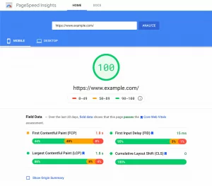
- Your web should be fast, to load in less than 2 seconds if possible.
- Your website must be clean and clear, without distracting visual elements of the content.
- Your website should be fully responsive. The web and its contents must adapt to the device from which they are visualized.
- You must provide well-structured, engaging, relevant, and innovative content.
- It offers new content frequently because the mobile user is a significant consumer of the content.
Are you ready to offer mobile content?
If you have any strategy to offer content to mobile users or have any doubts or questions, please share in the comment box.


